|
Julie Miller | Covers, Covers, Covers
June 22, 2009
Thank you to Sara Reyes and the gang at Fresh Fiction for inviting me to blog
with them this month! I’m honored. Today, I’m going to be talking
Harlequin Intrigue. Since Intrigue is celebrating its 25th anniversary this year, I thought it'd be
fun to share some Intrigue covers, and show how the look of our beloved
romantic suspense novels have changed over the years. 1. Here's where it all started, with THE KEY by Rebecca Flanders.
 2. Then we went through a "white" period--I discovered
43 Light Street series by Rebecca York in this phase--read bunches of the white covers in
college. 2. Then we went through a "white" period--I discovered
43 Light Street series by Rebecca York in this phase--read bunches of the white covers in
college. 3. Then the art department began tweaking the white covers. And hey, this is a
good time to point out that several NY Times, Publishers Weekly, USA
Today and Borders/Waldenbooks bestselling authors have written—and are
still writing!—for Intrigue. 4. Then we went into a "color" phase. I loved the rich colors and background
details of the covers, though the pictures were tiny--and I do love to see a
nice shot of a hunky hero. Here's Patricia Rosemoor's TORCH JOB--it has one of my favorite lines ever in an Intrigue.
You'll have to read it to see what the hero says to the heroine at the end. 5. We also had a cartoonish phase that featured a lot of drawings--not my
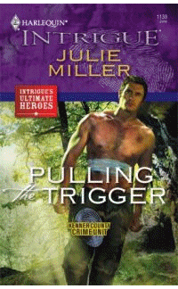
personal favorite--but the titles and author names were certainly clear. 6. Then we get into the signature "purple" era, when I started publishing with
Intrigue in 2000. Here's an example. The signature "thumb print" has now become
the trademark for Intrigue, no matter what the cover looks like. More recently,
the art department has started to "bleed" the cover art beyond the square on
the lower 2/3 of the picture--that gives me a full shot of those nice heroes I
love. See? We can do tender and romantic (one of those brief moments when our
characters are catching their breaths between dangerous encounters in our books) 7. Intrigue covers went through an experimental phase--trying a mainstream look
that really played up the suspense. Some of their best stories ever, but not
great for sales. Maybe because readers couldn't identify them as Intrigues? Or,
again, they wanted to see those heroes. But it was an interesting experiment. 8. And did I mention I like a good shot of the hero? How about this sizzler?
Hero-alone covers seem to be especially popular among Intrigue readers. 9. Single-author and multi-author continuity or miniseries do particularly well
at Intrigue. They’re given a flash, or logo, to tie them together by theme or
author. 10. And finally, one of my favorite features of Intrigue covers (and from what
I hear it's a favorite with readers, too) is when we have an annual or
biannual "Intrigue's Ultimate Heroes" month, featuring nothing but the best in
men--cops, military men, sheriffs, cowboys, spies, crime scene investigators,
private detectives, you name it--on the covers. You can see all 6 covers for
this month's Ultimate Heroes on the www.eHarlequin.com website, and the
Intrigue Authors Group Blog there. I have to give kudos to Harlequin's art
department. I think my cover this month is one of my best ever--I'd get lost in
the mountains with a man like that any day.
So what are some of your favorite Intrigue covers? Which style do you like?
What would you like to see more of? Let's dish and reminisce. Enjoy,
Julie Miller Julie Miller is an award-winning author of breathtaking romantic
suspense--with a National Readers Choice and a Daphne du Maurier among other
prizes. This year she earned a Romantic Times Career Achievement Award for
Series Romantic Suspense. Several of her 35+ books have appeared on the USA
Today and Borders/Waldenbooks bestseller lists.
Comments
11 comments posted.
Re: Julie Miller | Covers, Covers, Covers
I like the Intrigue's Ulitmate Heroes covers!!!
Sweet looking hunks!
(JoAnn White 12:16pm June 22, 2009)
I love to see the hunky guy on the cover, but I want the background to be specific to the content of the book. I love Suzanne Brockman's books...her characters are super.
(Robin McKay 12:52pm June 22, 2009)
I love seeing the hero or heroine on the cover but I would really love it if it matched the descriptions in the book
(Diane Sadler 6:57pm June 22, 2009)
I agree with Robin and Diane. I don't trust publishers when they don't match the cover with the story.
(Karin Tillotson 7:01pm June 22, 2009)
When I'm looking through a book rack, I'm often drawn to a book by the cover. I guess that I don't subscribe to the saying 'you can't judge a book by its cover.
(Rosemary Krejsa 9:20pm June 22, 2009)
I like the covers for the most part of the new Intriques - but it really ticks me off for the covers not to match the description of the hero or heroine in the book!!
(Martha Lawson 12:02pm June 23, 2009)
Intrigue is my favorite Harlequin line.
The current blue cover with the
fingerprints is my preference. Your
Kansas City Finest series is one of my
favorites. The Colby Agency books
were good. Read the Thurlos. Always
pick up a Debra Webb book. Have read
a few of the 43 Light Street books. It
is too late to think, I can think of
stories, but not the title or authors.
Let us just say, I haven't met an
Intrigue I haven't liked.
(Patricia Barraclough 12:16pm June 23, 2009)
Proving once again that we all judge the book by its cover to some extent...
(Mindy Ewing 3:36pm June 23, 2009)
Hey, gang--
A thousand apologies for not responding to your comments on Monday. I ended up having to deal with some family stuff that took most of the day, and I just plumb forgot!
Everything is fine now, but I wanted to drop by and apologize. I appreciate all the kind comments about my books and about Intrigue and its covers.
The covers really went through some changes, yes? I think it's an interesting glimpse of our cultural history and how what "sells" a book has changed over the years.
Again, thanks for stopping by!
Julie
(Julie Miller 1:36pm June 24, 2009)
Diane and Karin--I'm with you... it can nag at my subconscious when I'm reading a book if the cover art doesn't match the character description on the pages. It won't stop me from buying the book, but it'll bug me ;)
Julie
(Julie Miller 1:37pm June 24, 2009)
My favorites are probably the hero-alone covers--if they get the hero right!
I do love my NINE-MONTH PROTECTOR cover with the pregnant heroine--but mostly because the DID get Detective Cooper Bellamy right, and, the palette of colors is just so soothing and gorgeous. It really conveys tenderness, shelter, protection to me--that tender ambiance is a rarity on Intrigues.
Julie
(Julie Miller 1:40pm June 24, 2009)
Registered users may leave comments.
Log in or register now!
| 


 © 2003-2024 off-the-edge.net
all rights reserved Privacy Policy
© 2003-2024 off-the-edge.net
all rights reserved Privacy Policy